ANTAGONIST BREWING
Overview
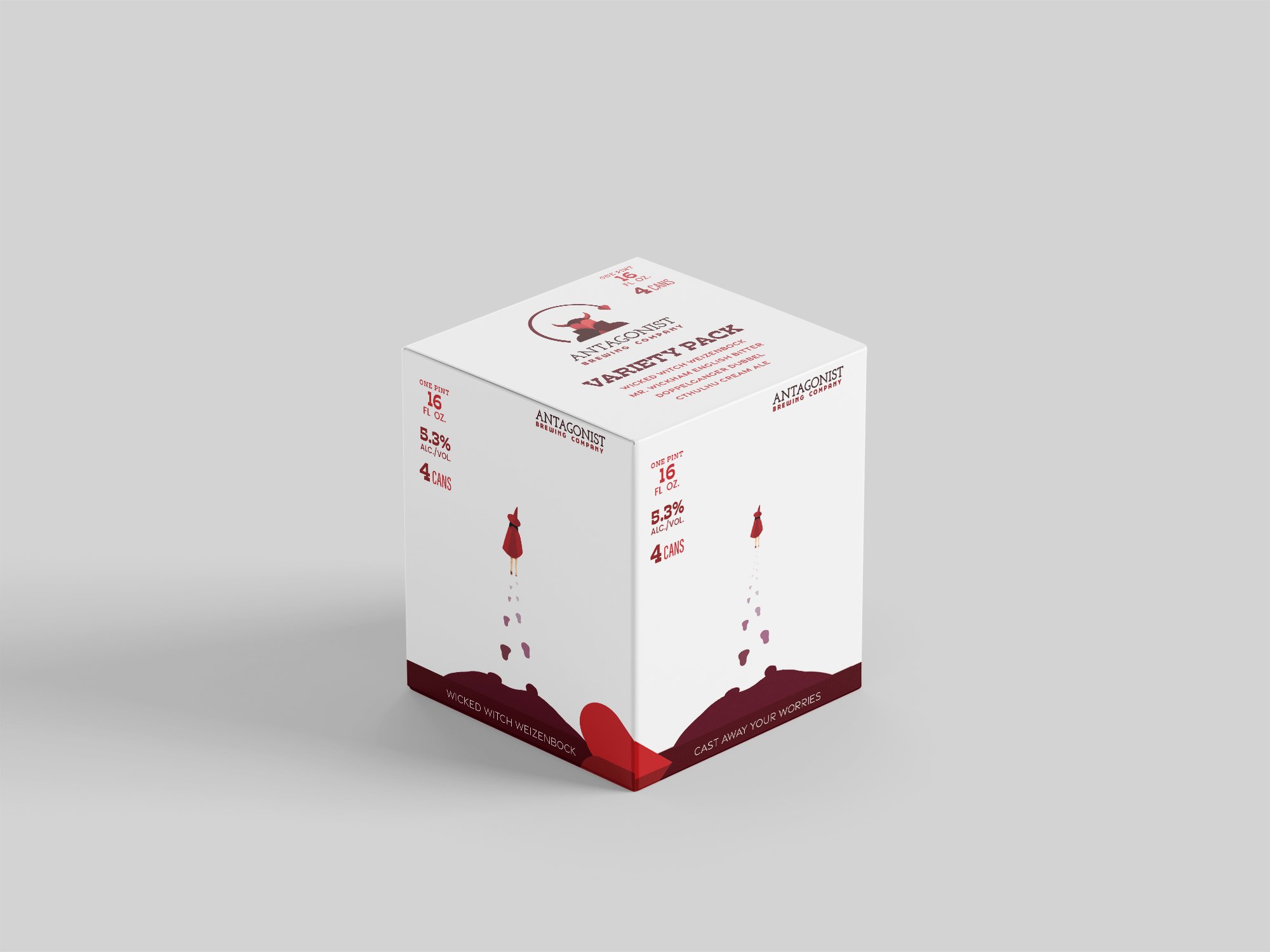
The primary objective of this design project was to develop a unified visual identity for a beer company, encompassing the design of the beer can, packaging box, and logo. To achieve this, I employed a geometric shape-based approach to personify a devilish character that embodies the brand's personality.
In designing the beer can, I applied a deliberate color strategy, combining warm and saturated hues in the foreground with softer, cool tones in the background to create visual harmony. Additionally, I utilized atmospheric perspective to add depth and dimensionality to the composition.
For the packaging box, I adopted a minimalist design philosophy to ensure the beers remain the focal point when removed from the box. The design features a subtle, graduated effect on each side, where the witch character gradually fades into the background, creating a sense of continuity and visual interest


